Overview
Scenario theme provides a set of universal block components that can be freely added to any section. These blocks ensure consistent design and flexible layout control across your store.
General Settings
Full width / Background
The following settings are available in nearly every main block and section, allowing you to customize layout, spacing, and appearance uniformly.
-
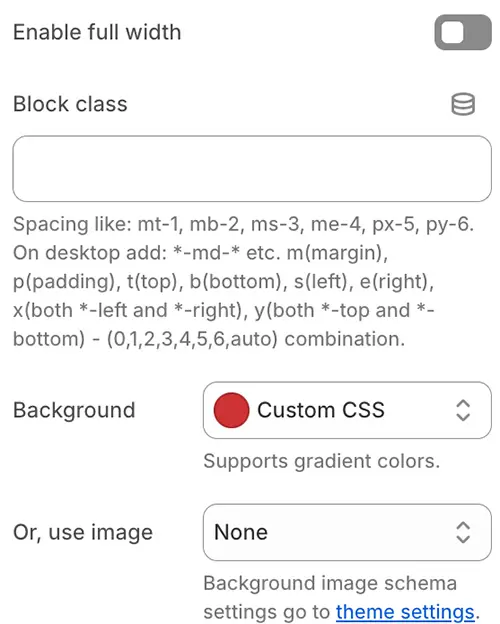
Enable full width: Expands the block container to 100% of the viewport width (ignoring the site’s maximum content width). Ideal for full-bleed banners or backgrounds.
-
Block class: Adds custom CSS classes to the block container—commonly used for utility classes like spacing (
mt-4,pb-6) or custom styling hooks.Spacing utilities that apply to all breakpoints, from xs to xxl, have no breakpoint abbreviation in them. This is because those classes are applied from min-width: 0 and up, and thus are not bound by a media query. The remaining breakpoints, however, do include a breakpoint abbreviation.
The classes are named using the format
{property}{sides}-{size}for xs and{property}{sides}-{breakpoint}-{size}for sm, md, lg, xl, and xxl.Where property is one of:
- m - for classes that set margin
- p - for classes that set padding
Where sides is one of:
- t - for classes that set
margin-toporpadding-top - b - for classes that set
margin-bottomorpadding-bottom - s - (start) for classes that set
margin-leftorpadding-leftin LTR,margin-rightorpadding-rightin RTL - e - (end) for classes that set
margin-rightorpadding-rightin LTR,margin-leftorpadding-leftin RTL - x - for classes that set both
*-leftand*-right - y - for classes that set both
*-topand*-bottom - blank - for classes that set a
marginorpaddingon all 4 sides of the element
Where size is one of:
- 0 - for classes that eliminate the margin or padding by setting it to 0
- 1 - (by default) for classes that set the margin or padding to 0.25rem
- 2 - (by default) for classes that set the margin or padding to 0.5rem
- 3 - (by default) for classes that set the margin or padding to 1rem
- 4 - (by default) for classes that set the margin or padding to 1.5rem
- 5 - (by default) for classes that set the margin or padding to 2rem
- 6 - (by default) for classes that set the margin or padding to 2.5rem
- auto - for classes that set the margin to auto
Examples:
py-md-6 py-4 -
Background: Sets a solid color or gradient background for the block container.
-
Or, use image: Instead of a solid background, apply a predefined background image style from your Theme Settings → Style scheme settings → Background Image Schema (configured in Theme Settings). This option leverages your pre-saved image, repeat, position, and attachment settings for consistency.
Animations on scroll
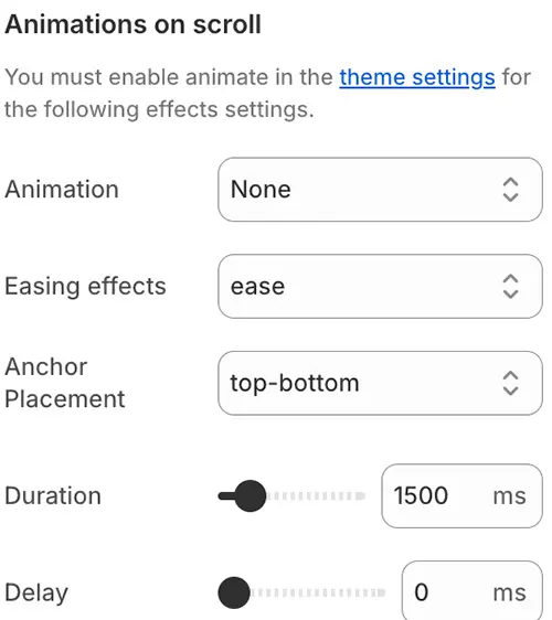
Scroll animations require the AOS (Animate On Scroll) library (aos.js) to be loaded. To enable this feature, go to Theme Settings → Advanced and turn on “Enabled animate element on scroll”.
Once enabled, you can configure scroll animations on individual blocks using the following parameters:
-
Animation: The type of entrance effect. Options include:
fade,fade-up,fade-down,fade-left,fade-right,
flip-up,flip-down,flip-left,flip-right,
zoom-in,zoom-out,slide-up,slide-down, etc. -
Easing effects: Controls the acceleration curve of the animation.
→ Keep the default value unless you have a specific motion design requirement. -
Anchor Placement: Defines where in the viewport the animation should trigger.
Options:top-bottom,top-center,top-top,center-bottom, etc.
(e.g.,top-bottommeans the animation starts when the top of the element hits the bottom of the viewport) -
Duration: How long the animation lasts, in milliseconds (ms).
Example:600= 0.6 seconds. -
Delay: Time to wait before starting the animation after it’s triggered, in milliseconds (ms).
Example:200= 0.2-second delay.
Blocks category
Blocks are the modular, reusable components that power your Scenario theme. They can be added to sections, nested within other blocks, or used to build complex layouts—all without writing code.
This section is organized into four categories to help you find the right block for your needs:
🧱 Basic Block
Foundational elements: Heading, Text, Button, Image, Video, 3D Model, Countdown Timer, and more.
Explore →📄 Specific Page Block
Blocks for native pages: List Collections, Blog Posts Lists, and more.
Explore →🔍 Subblocks of Specific Block
Specialized child blocks: Product Cards, Cart Checkout, Filters, Variant Picker, and more.
Explore →🧩 Composite Function Block
Advanced features: Contact Form, FAQ Tabs, Discount Code, Pop Up, Custom Liquid, and more.
Explore →