Style Schemes
The Scenario theme includes a powerful Style Schemes system that lets you define reusable design presets for common UI elements. These schemes can be applied across sections and blocks, ensuring visual consistency while reducing repetitive configuration.
🎯 1. Variant Swatches Schema
In the variant style options of blocks, select the scheme number that corresponds.
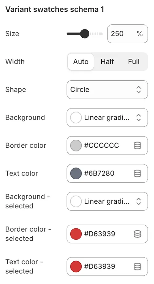
- Size: Swatch size as a percentage of the root font size (e.g.,
125%= 1.25 × root font size). - Width: Layout width of the swatch container:
auto: Width adjusts to contenthalf: Takes 50% of the container widthfull: Spans 100% of the container width
- Shape: Visual shape of the swatch:
none: No roundingRounded 1–5: Increasing corner radius (1 = subtle, 5 = highly rounded)Circle: Fully circular (for square swatches)Pill: Capsule-shaped (ideal for text-based swatches)
- Background: Default background—supports solid colors, gradients, or
transparent. - Border color: Outline color in the default state.
- Text color: Color of the label or icon inside the swatch.
- Background – selected: Background when the variant is active (supports gradients or
transparent). - Border color – selected: Border color when the swatch is selected.
- Text color – selected: Text/icon color in the selected state.
✅ Applied in blocks via Swatch Scheme #1–8 dropdown.
🖼️ 2. Background Image Schema
In the background image option of each section's main blocks, select the scheme number that corresponds.
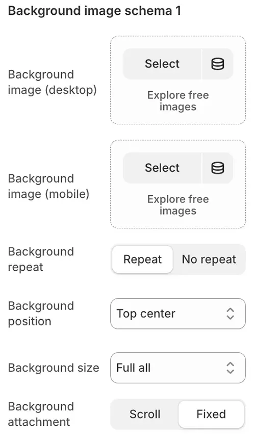
- Background image (desktop): High-res image for large screens
- Background image (mobile): Optimized image for mobile
- Background repeat:
repeat,no-repeat, etc. - Background position: Alignment (e.g.,
center top) - Background size: Typically
coverto avoid distortion - Background attachment:
Scroll(default) orFixed(parallax effect)
✅ Selectable in section settings as Background Scheme #1–5.
📦 3. Cards Style Schema
Used for product cards, blog cards, login boxes, etc. In the card style option of blocks, select the corresponding number.
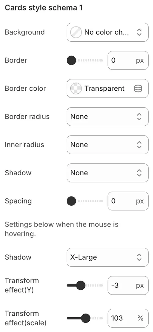
- Background: Card background—supports solid colors, gradients, or transparent values.
- Border: Border thickness in pixels (
px). Set to0to remove the border entirely. - Border color: Color of the card’s outer border.
- Border radius: Corner style:
none: Sharp cornersRounded 1–5: Increasingly rounded corners (1 = subtle, 5 = highly rounded)Circle: Fully circular (best for square containers)Pill: Capsule-shaped (ideal for rectangular cards with text)
- Inner radius: Radius applied to inner elements (e.g., product images inside the card) using the same shape options as above. Ensures visual harmony when spacing is applied.
- Shadow: Drop shadow for depth. ⚠️ Performance note: Complex shadows can impact rendering speed—use
nonefor optimal performance. - Spacing: Internal padding in
px(0= no padding).
Hover Effects - Settings below when the mouse is hovering.
- Shadow: Enhanced or alternate shadow when the user hovers over the card.
- Transform effect (Y): Vertical movement on hover (e.g.,
+4pxlifts the card up;-2pxpushes it down). - Transform effect (scale): Zoom effect on hover (e.g.,
105%= slight enlargement;95%= subtle shrink).
📋 4. Selector Style Schema
Style for enhanced <select> dropdowns (powered by Nice Select2). The nice select2 effect is enabled for form select options. By default, it displays the Selector scheme. It is used for currency and language selectors, as well as country and province selections in address and shipping cost calculations. Simply set the style scheme number in the corresponding location.
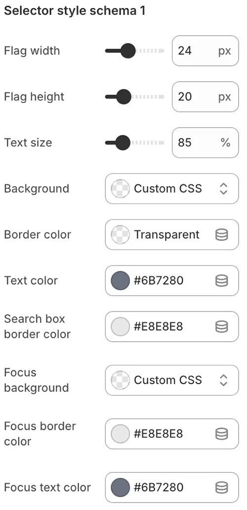
- Flag width: Width of the country flag (SVG) in the selector or dropdown menu, in
px. - Flag height: Height of the country flag (SVG) in the selector or dropdown menu, in
px. - Text size: Font size of the selector text, expressed as a percentage relative to the root font size (e.g.,
100%= same as root). - Background: Background of the selector—supports solid colors, gradients, or transparent values.
- Border color: Color of the selector’s outer border.
- Text color: Color of the displayed text inside the selector.
- Search box border color: Border color of the search input field (when search is enabled in the dropdown).
- Focus background: Background color when the selector is focused or opened.
- Focus border color: Border color when the selector is focused or opened.
- Focus text color: Text color when the selector is focused or opened.
📥 5. Dropdown Style Schema
Generally for sub-level dropdown navigation or the dropdown menu that expands after a select option, select the style scheme number that corresponds in the options.
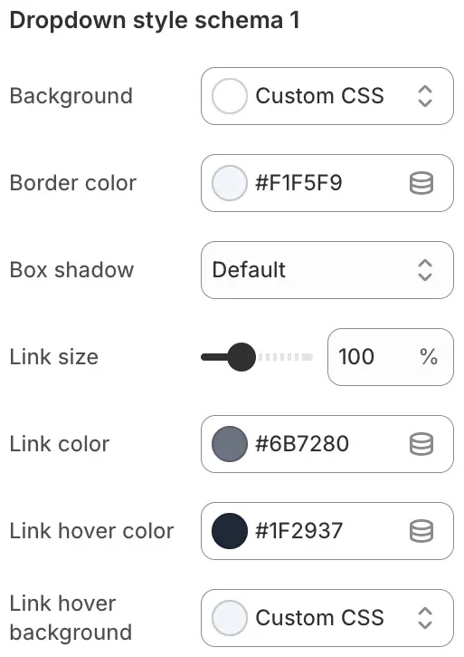
- Background: Background of the entire dropdown menu—supports solid colors or gradients.
- Border color: Color of the dropdown menu’s outer border.
- Box shadow: Shadow effect applied to the dropdown for depth and visual separation.
- Link size: Font size of the links inside the dropdown menu.
- Link color: Text color of the dropdown links in their default state.
- Link hover color: Text color when a user hovers over a dropdown link.
- Link hover background: Background color behind the link on hover.
🔗 6. Navbar Style Schema
Mainly used for the main navigation in the header position or the navigation style settings in other application navigation link blocks, select the style scheme number that corresponds in the options.
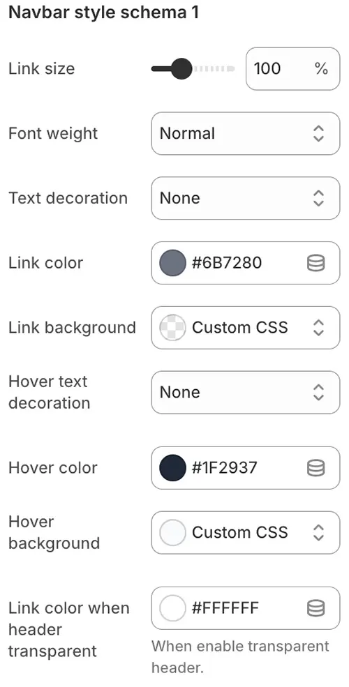
- Link size: Font size of navigation links.
- Font weight: Thickness of link text—options include bold, normal, light, etc.
- Text decoration: Visual styling for links in their default state (e.g.,
none, underline, overline, line-through). - Link color: Text color of navigation links.
- Link background: Background color behind navigation links.
- Hover text decoration: Link decoration on hover (e.g.,
none, underline, overline, line-through). - Hover color: Text color when a user hovers over a link.
- Hover background: Background color behind the link on hover.
- Link color when header transparent: Text color for navigation links when the header is set to transparent mode (e.g., over hero banners or images).
🗂️ 7. Mega Style Schema
After enabling the Mega setting in the main navigation of the header, define the style scheme for the popped-out Mega menu by binding the style scheme number here.
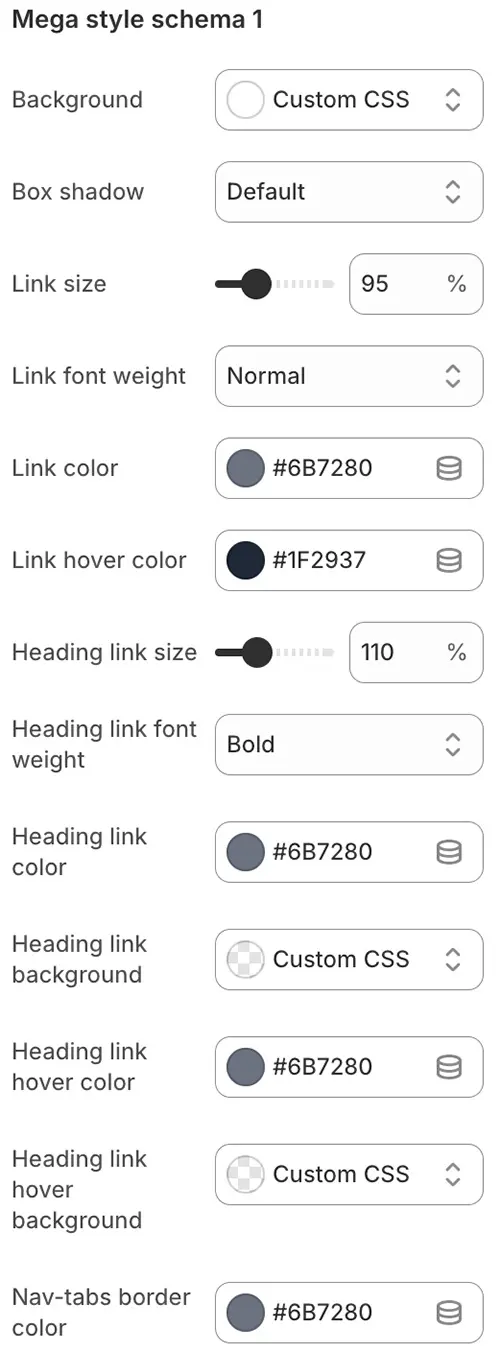
- Background: Background color of the entire Mega menu—supports solid colors or gradients.
- Box shadow: Drop shadow applied to the Mega menu for visual depth and separation from page content.
- Link size: Font size of standard navigation links within the Mega menu.
- Link font weight: Text thickness for standard links (e.g., normal, bold, light).
- Link color: Default text color of standard links.
- Link hover color: Text color when hovering over a standard link.
- Heading link size: Font size for heading-level links (e.g., tab titles or grid category headers).
- Heading link font weight: Font weight for heading-level links.
- Heading link color: Text color of heading-level links in their default state.
- Heading link background: Background color behind heading-level links (especially relevant in tab layouts).
- Heading link hover color: Text color of heading-level links on hover.
- Heading link hover background: Background color behind heading-level links on hover.
- Nav-tabs border color: Border color for the
nav-tabsstyle when used inside the Mega menu (e.g., bottom border of active tab).
💰 8. Price Style Schema
Prices have different display requirements on product pages, collection pages, or shopping cart pages. You can bind the preset style scheme number here.
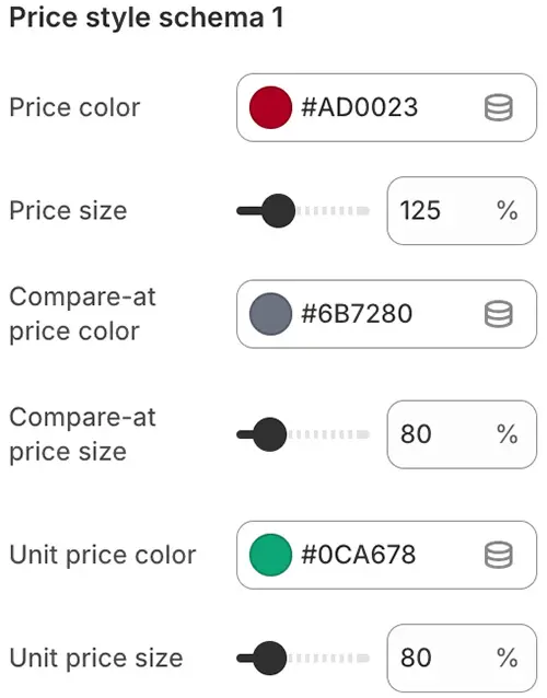
- Price color: Text color of the main product price (e.g., sale price or regular price).
- Price size: Font size of the main product price.
- Compare-at price color: Text color of the original/strikethrough price (used to show discounts).
- Compare-at price size: Font size of the compare-at price.
- Unit price color: Text color for unit pricing (e.g., “$2.50 / kg”), if enabled in your store settings.
- Unit price size: Font size for unit pricing text.
✅ Assign different schemes per context (e.g., product page vs. collection grid).
✏️ 9. Input Style Schema
Or the style scheme for input box groups, commonly used in contact forms, login boxes, shipping cost calculations, address changes, and other situations that require input boxes. You can bind the preset style scheme number here.
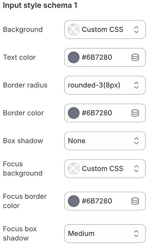
- Background: Background color of the input field.
- Text color: Color of the text inside the input field.
- Border radius: Corner roundness of the input field (e.g.,
4px,8px, or pill-shaped). - Border color: Color of the input field’s border in its default state.
- Box shadow: Drop shadow applied to the input for depth or visual emphasis.
- Focus background: Background color when the input field is active (clicked or tabbed into).
- Focus border color: Border color when the input is focused.
- Focus box shadow: Shadow effect displayed when the input is in focus (often used to highlight active fields).
📊 10. Inventory Level Style Schema
Used when displaying products with inventory levels enabled, the style displayed is bound to the style scheme number here.
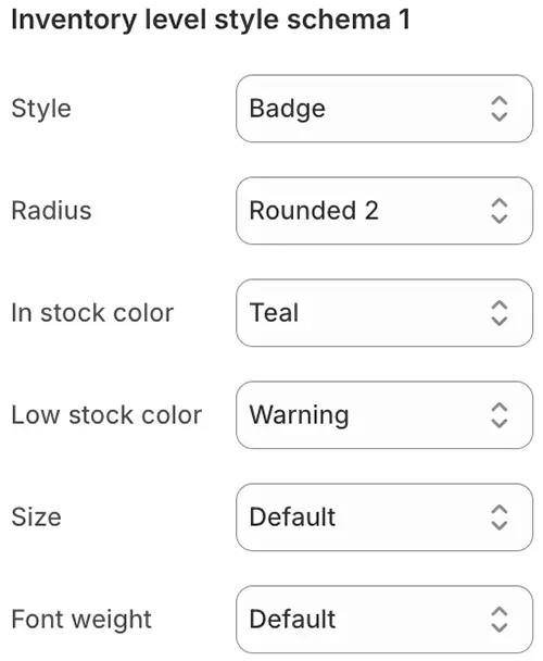
-
Style: Display style for inventory level indicators. Options include:
Button: Solid background with full color fillOutline: Hollow border with background appearing only on hoverBadge: Compact badge-style label (supports*-ltlight color variants)Link: Text styled as a clickable linkText: Plain text with no interactive styling
-
Radius: Corner roundness (e.g.,
Rounded 1–5,Pill, orCircle) -
In stock color: Text or background color when inventory is sufficient
-
Low stock color: Color used when stock is running low (typically a warning tone like orange or red)
-
Size: Available only for
Buttonstyle—choose fromSmall,Medium, orLarge -
Font weight: Text thickness (e.g.,
normal,bold,light)
🏷️ 11. Sales Status Style Schema
Used to mark the display styles of Sale/Sold out/Pre-order on the main product image. In product pages or product list cards, bind the preset style scheme number here.

- Size: Overall container size of the sales status badge (e.g., small, medium, large).
- Position: Placement of the badge on the product image. Options include:
Top left,Top center,Top right,Center,Bottom left,Bottom center,Bottom right. - Text size: Font size of the text inside the badge.
- Text color: Color of the text within the sales badge.
- Rotate: Rotation angle (in degrees) applied to the entire badge (e.g.,
-15°for a tilted “Sale” tag). - Sale background / text color: Background and text colors used when the product is on sale.
- Sold out background / text color: Background and text colors displayed when the product is sold out.
- Pre-order background / text color: Background and text colors shown when the product is available for pre-order.
🔍 12. Search Bar Style Schema
The search bar is generally displayed at the top of the header and on the Search page. You can bind the preset style scheme number here separately.
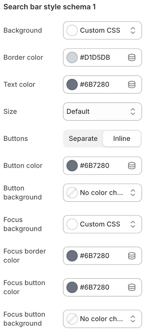
- Background: Background color of the entire search bar.
- Border color: Color of the search bar’s outer border.
- Text color: Color of the text entered or displayed in the search input field.
- Size: Overall size of the search bar—choose from
Small,Medium, orLarge. - Buttons: Button display style:
Separate: Button is distinct from the input (background and color configurable)Inline: Button appears inside the search field as an icon only (no background)
- Button color: Text or icon color of the search button.
- Button background: Background color of the search button (applies only when Buttons is set to
Separate). - Focus background: Background color when the search input is active (clicked or focused).
- Focus border color: Border color in the focused state.
- Focus button color: Button/icon color when the search bar is focused.
- Focus button background: Button background color in the focused state (for
Separatestyle only).
🏷️ 13. Tags Style Schema
Used for article tags or other blocks that need to display multiple tag styles. You can bind the preset style scheme number here.
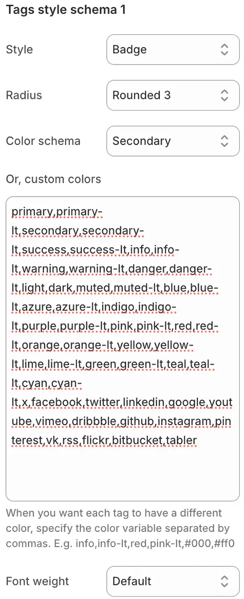
-
Style: Display style for tags. Options include:
Button: Solid background with full fillOutline: Hollow border with background appearing only on hoverBadge: Compact badge-style label (supports light color variants like*-lt)Link: Text styled as a clickable linkText: Plain text with no interactive styling
-
Radius: Corner roundness (e.g.,
Rounded 1–5,Pill, orCircle) -
Color schema: Choose a single color variable from the Color Variables list to apply uniformly to all tags
-
Or, custom colors: Assign a unique color to each tag using a comma-separated list of color variables or hex codes.
Example:info,info-lt,red,pink-lt,#000,#ff0Main color code:
primary,secondary,success,info,warning,danger,light,dark,muted,blue,azure,indigo,purple,pink,red,orange,yellow,lime,green,teal,cyan,x,facebook,twitter,linkedin,google,youtube,vimeo,dribbble,github,instagram,pinterest,vk,rss,flickr,bitbucket,tabler,custom-color-1,custom-color-2When Style is "Badge", the following variable colors are also supported
primary-lt, secondary-lt, success-lt, info-lt, warning-lt, danger-lt, light-lt, dark-lt, muted-lt, blue-lt, azure-lt, indigo-lt, purple-lt, pink-lt, red-lt, orange-lt, yellow-lt, lime-lt, green-lt, teal-lt, cyan-lt📌 The theme will cycle through these colors for consecutive tags.
-
Font weight: Text thickness (e.g.,
normal,bold,light)
✅ Ideal for dynamic tag clouds with varied visual emphasis.